.png)
PROJECT OVERVIEW
Navigating complex product catalogs often leads to decision paralysis and high drop-off rates for users. Seeking to optimize the digital journey, Hubo aimed to redesign their platform to elevate the user experience and drive higher conversion rates.
Partnered with a Senior UX Designer to identify strategic design paths and execute mid-fidelity wireframes for landing, category page and checkout page.
TEAM
UX designers,visual designer, PM
TIMELINE
2024
MY ROLE
UX Design intern
COMPANY
DEPT
DIY projects are often intimidating for beginners.
PROBLEM STATEMENT
Without visible expert support, users felt unsure about their technical choices. This uncertainty, especially for novices, led to high friction during the discovery phase and frequent abandonment at the payment flow.
Users

Sara
Beginner + low technical experience
PAINPOINT
Feels overwhelmed when deciding
Doesn't know what she wants
NEED
Step-by-step guidance
understanding of materials
Inspiration

Mike
Intermediate + Medium technical experience
PAINPOINT
Overwhelming Product menu
Doesn't know what she wants
NEED
Faster and predictative search
Market research
STRENGTHS
Themes/ Inspiration
Organized product menu
WEAKNESS
Lack of personalized recommendations
Limited guidance on material selection


DESIGN SOLUTION
Guided Discovery Questionnaire: A strategic intake flow that identifies the user's specific project needs to recommend the perfect materials automatically.
Curated Themes & Styles: A visual inspiration gallery designed to help users define their aesthetic and navigate toward matching product sets.
Expert-Led Positioning: Strategically placed "Expert Advice" touchpoints that emphasize Hubo’s professional knowledge, building trust at key decision moments.action.
Streamlined Multi-Step Checkout: A simplified, linear payment flow that reduces cognitive load and ensures a fast, frictionless transaction.
Design
.png)
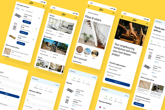
We focused on showcasing the full range of Hubo’s products and services, positioning it as a friendly expert that guides novices step by step through their projects.
Meanwhile, the navigation supports efficiency, helping experienced users complete tasks faster and more intuitively.
Hubo empowers people to confidently complete DIY projects by helping them easily find the right materials, tools, and guidance.


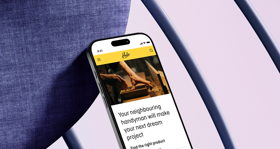
LANDING PAGE
The main page focuses on helping users find the right products by asking what they want to build. Additionally, different categories are designed to better organize items and make product discovery easier.

This redesign simplifies the shopping journey by using a clean, card-based layout that prioritizes key product specs and visual clarity. By integrating expert advice into the feed, the interface guides DIY users through technical choices.

CHECKOUT
The redesign features a streamlined multi-step checkout with a clear progress tracker to reduce user friction and abandonment. By simplifying data entry and providing a transparent order summary, it ensures a fast, trustworthy payment experience.
IMPACT
We streamlined the discovery process so users can identify their project needs in seconds. By integrating expert advice throughout the journey, we transformed the platform from a standard store into a trusted partner for every DIY builder.